OSU Visual Communication| Branding
Fall 2024
NAMI, National Alliance on Mental Illness, is the nation's largest grassroots organization focused on building better lives for all Americans experiencing mental illness. As a part of the Intermediate Vis Comm Design course, I chose this organization to rebrand.
NAMI REBRAND


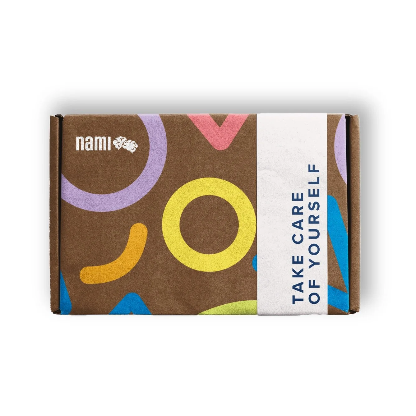
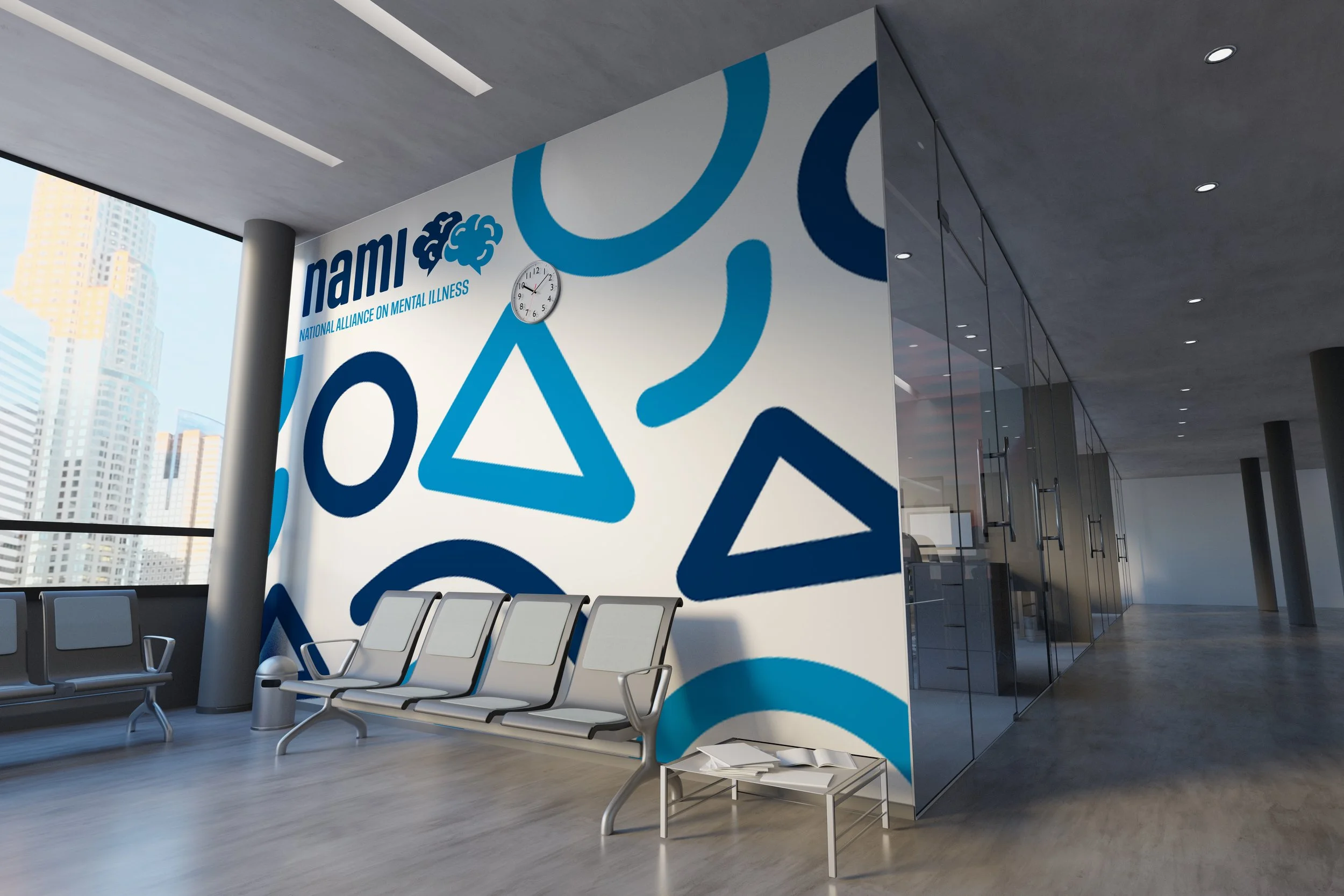
Inviting and Welcoming. As NAMI serves as a nationwide organization catering to every diversity, the brand should be recognizable and immediately create a connection between the client and the company. My direction was to cater to warmth, personality, and engagement when rebranding.
The Goal:


The new logo refreshes the typography and includes brains, as mental illness is the organization's core. This new signature creates an approachable look for all ages while remaining professional through its color choices.
NAMI has multiple competitors, but a stand out of their brand is that they cater to everyone. This unique feature needed to be emphasized for inclusivity and broadness to any audience.
Process:


Iterations for the brand, focusing on keywords such as trustworthy, educational, advocate, and diverse which led to initial sketches.
Final Mark and Signature:


The mark symbolizes mental health dialogue with overlapping brains and a text message stem.
The signature utilizes NAMI’s acronym, Social Gothic as the typography, and use of primary colors.
Brand Application:


Icons & Stationery:


